

Welcome Silesia
Welcome Silesia
Book regional attractions of Silesia.
Fast and with short advance.

About the client
Welcome Silesia is an online platform that allows you to quickly and easily book attractions during your stay in the Silesia region of Poland.
The idea is to promote the region by making it as easy as possible to reserve new experiences.
Scope of work
Brand manual
Brand workshop
Logo project
Brand visual strategy
Brand messaging strategy
Identification elements
Promotional materials
Online platform – functional mockups (UX)
Online platform – layout (UI)
Online platform – development – Grzegorz Koczy, itmFOX
Mobile app – development – Grzegorz Koczy, itmFOX
Start of the project
We had a clear plan: to create an online platform allowing quick reservations for exciting trips in Silesia. However, there was no vision for how it should visually communicate.
We prepared a project timeline and began with a workshop where we defined the goals and principles of the newly emerging brand.

Key project assumptions
01
Show the promise of a time well spent. Refer to free time, trips, movement.
02
Communicate the diversity of the region and the wide variety of attractions that are available.
03
Refer to the Silesian character, communicating it in an unobtrusive way, if possible.


Brand symbol
The main goal was to avoid incorporating the most typical Silesian accents that might be unclear to international customers.
Instead, we chose to focus on symbols related to travel, leisure, motion, and movement. This approach will emphasize the dynamic nature of the brand while still keeping a promise of time well spent.
Fortunately, we managed to include a subtle reference to the industrial character of Silesia – in the form of a gear, which is a universal symbol that shouldn't cause confusion.

Visual strategy
Colors
The selected color scheme emphasizes the diversity of the region. Green, yellow, and red are associated with specific categories of tours. The black color highlights the mining character of the region, referencing coal.
Typography
The chosen font is Rubik, a sans-serif typeface that effectively reflects the industrial character of the region while remaining friendly and soft in perception, thanks to the applied rounded elements.

Key visual: illustration
To highlight the region's diversity and the wide range of leisure opportunities, an illustration reflecting these values has been designed.
The illustration references iconic buildings and elements in the Silesian region as well as possible sport activities. It can be used in many ways, both in marketing materials and on gadgets.


Brand use case
The offer is primarily aimed at individuals who spend a short time in Silesia but still have free time they want to make the most of.
The proposed 'Just around the corner' campaign is focused on placement at airports, near hotels, and within the hotels themselves. Its goal is to quickly make recipients aware that interesting attractions are within reach (or rather, within reach of their smartphones).


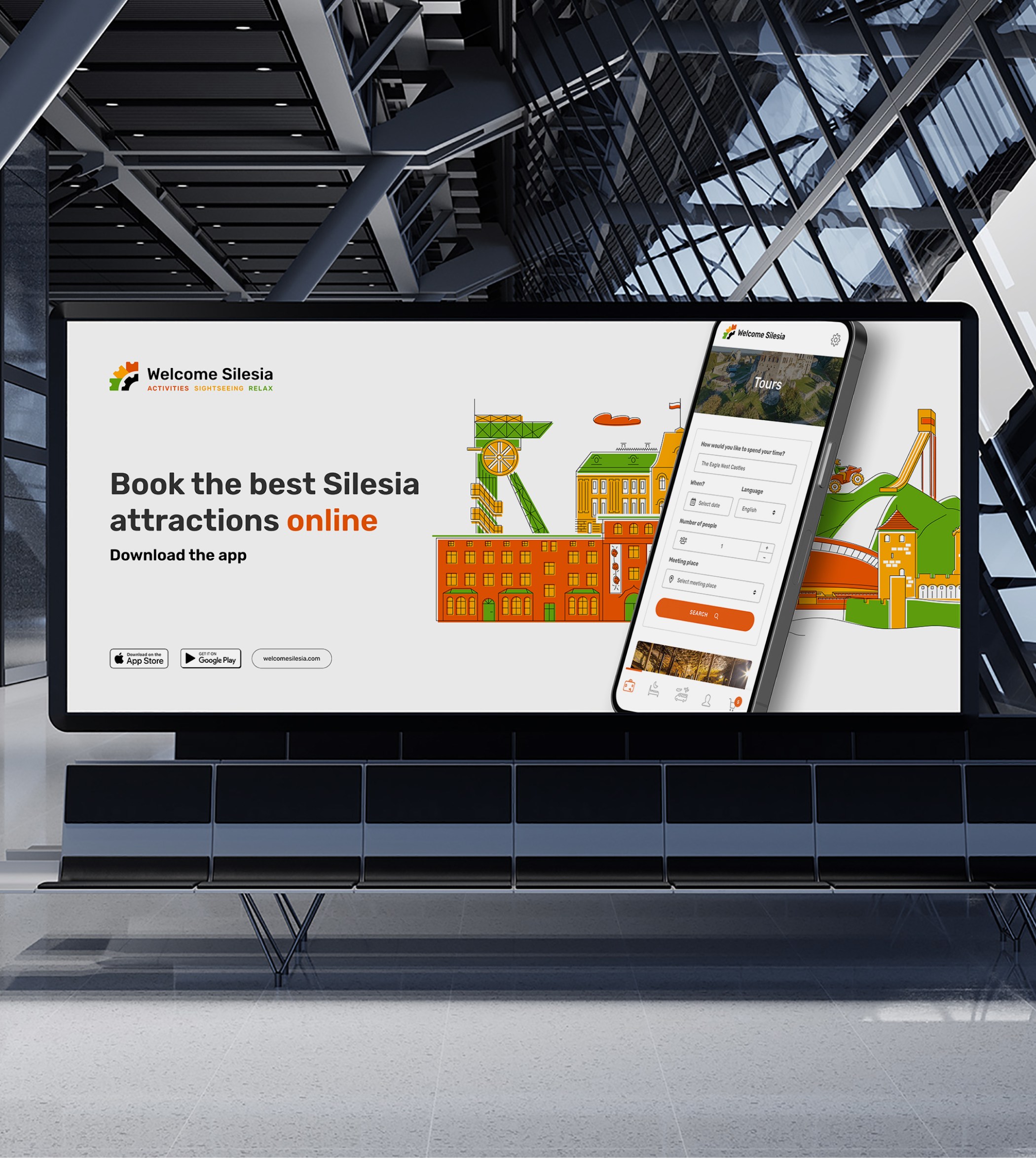
Webdesign and mobile app
The Welcome Silesia online service aims to enable the quickest discovery and booking of attractions in the Silesian region. The central part of the service is a search engine that allows to find both attractions and accommodation options.
Additionally, a mobile app has been created, mirroring the website's layout and functionality.


Brand Manual + assets
The visual identity system's elements are well-organized, cataloged, and accessible in a user-friendly database
Furthermore, informative instructional materials, including a brand guide, have been developed to guide users on the effective utilization of this system.

This visual identity system helps:

Attract attention of potential customers
Visual identity builds brand recognition and accelerates the development of customer loyalty, crucial for boosting revenue.
Stand out
from
the competition
Clear communication around the brand's key strengths and features position it effectively in the market.
Save time and resources in daily brand management
An organized system allows more efficient day-to-day operations, especially in marketing and promotion.
"Lukasz is a professional who wants as many details as possible in order to deliver the right product. He is a top class graphic designer and his creativity goes well beyond any bounds I have ever seen. He is always cooperative, helpful, patient, and professional."
 | Mark Pacura |
Other projects


Wooden Banana
Natural way to grow your photo business

FTBL expert
The best prepared ones win
Let’s discuss how we can boost your business


The key is here.
ⓒ Lukasz Ociepka All rights reserved.
The website you are on use cookies. By continuing to browse the site, you agree to the privacy policy.